In Seattle, it is often gray beginning at the latter part of October and sputteringly ends about April. The dim light and short days can often be beautiful in their own subtle way, but also wear on the soul. To help keep things cheerful, let’s add color!
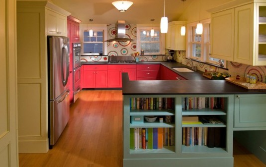
At live-work-play, we love working with color. We love bright color too. Our reputation with color was featured nationally recently. This Old House Magazine Jan/Feb 2013 issue, which is currently on newsstands features our use of color in this kitchen. Houzz showcased one of our bathroom designs in an article about Pantone’s color of the year, “emerald”. The bathroom features Fireclay Tile in Kelp color. 
Thinking about color— it is often an intuitive process. Sometimes people suggest noticing trends in your clothing colors to help you decide. That is a great first step. Often colors that we wear are not quite the color we would choose for our bathroom or our front door or roof. For interiors, sometimes the suggestion is to make everything neutral, and then accessorize with color or only paint color on the walls. How often do we change those accessories though? Probably not often enough. These are great starting points. Next steps are to notice what is around you. Do you like a color or texture at a friend’s house? Why? Do you see an idea in a magazine or on Pinterest or Houzz that appeals? That is something to bookmark.
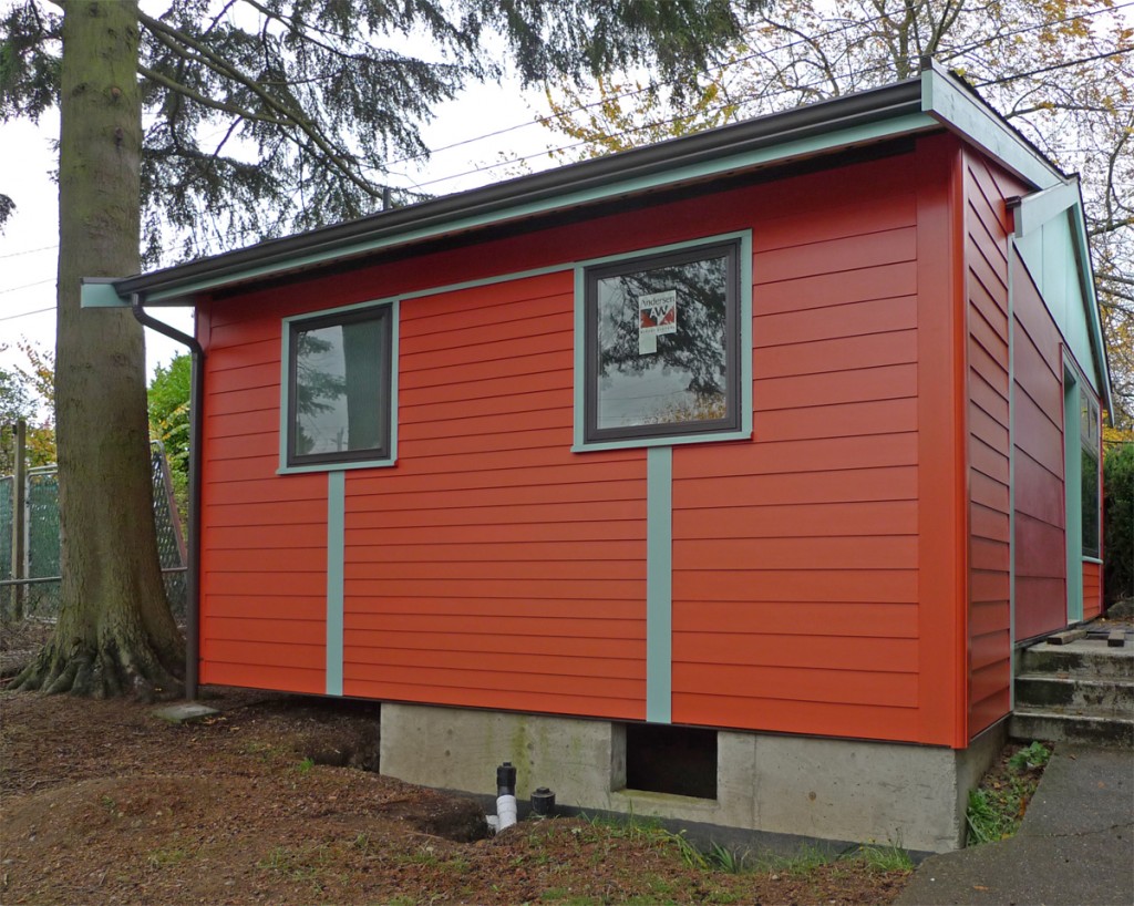
Find colors, materials, textures that you love, think about them for a while, bring samples into your home or paint them on the outside of your house and see what it is like to live with them. Make decisions based on living with them for a while. At this backyard cottage, we painted about seven or eight samples on the wall before deciding on the palette. It is four colors plus a door color: red, orange, two blues and yellow for the door. We looked at them in bright sunlight, on gray overcast days, morning and evening. Color and light are intertwined, so viewing a color or material in the various types of light is an important part of decision making.
Some of the ideas we think about: if we chose the colors and materials that we are thinking of and take a black and white photograph of them, will they all look like the same gray, or will there be some contrast? This has to do with brightness and saturation. Usually having some contrast works well. In the above-mentioned backyard cottage, there are many colors, but just three levels of brightness and saturation. This keeps the palette cohesive.
Need some inspiration? A book that we share with our clients is Annie Sloan’s Color Schemes: For Every Room. It is a book that focuses on interiors, but is great for thinking about exteriors too. After all, the exterior is just a different kind of room.
Need to geek out? There is a lot of basic color theory information available on the internet.
And of course, feel free to contact us!


